Tips for print CSS
It's very easy to overlook how a page will look when it's printed. This post will go through a few quick tips to make a page a little more print friendly.
Print media query
You can use a media query to limit rules to a particular media type:
@media print {
  /* print css goes here... */
}
Alternatively you can have a separate style sheet and specify the media type when you include it:
<link rel="stylesheet" media="print" href="/css/print.css">
Personally I prefer keeping everything together in a single style sheet, however either way will work.
Preview changes
I normally use the development tool built into Firefox when working with CSS; primarily the Style Editor and Page Inspector. This presents a slight problem when you are working with print specific rules, namely print specific CSS won't be displayed.
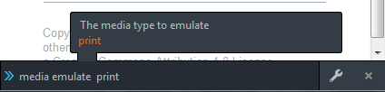
To get around this you can ask Firefox to emulate a media type. To do this
press shift + F2 to bring up the Firefox command line and
type media emulate print:
Note: you will still need to use print preview to check how content is broken across pages.
Hide unwanted content
Any elements like navigation or headers are probably not required when a page is printed. For this site everything in the sidebar is hidden:
@media print {
  .sidebar {
    display: none;
  }
}
Expanding links
Hyperlinks are obviously a little useless once a page has been printed. You
can use the content property to append the href attribute after the element
text. On this site I currently only expand links in the footer:
@media print {
  footer a:after {
    content:" ("attr(href) ")";
  }
}
Although I could do this for all links, paragraphs get a little tricky to read if too many long links are inserted.
Don't use click here
As an aside if you follow the W3C guidance and don't use link text like "click here" your links should still mean something, even if you can't follow the link.
Page margins
You can control page margins using the @page CSS at-rule:
@media print {
  @page {
    margin: 1cm;
  }
}
Note: When printing you should use measurement units like cm instead of
screen specific units like px.
Page breaks
Unlike displaying content on a screen, printing requires content is potentially
broken across multiple pages. You can control where content is broken using the
page-break-before, page-break-after and page-break-inside properties. A
good start would be to avoid page breaks directly after main headings, and
prevent large elements like blockquotes being split across multiple pages:
@media print {
  h2, h3 {
    page-break-after: avoid;
  }
  blockquote, pre, ul, ol, img {
    page-break-inside: avoid;
  }
}